top of page

Search


Python Data Analysis Tips - barplot Seaborn change outline color edit patches
DataSimple.education Certifications Data Analysis, Pandas, Seaborn, Plotly and More In Python learn how to use the barplot . This...
Jan 27, 20231 min read


Python Data Analysis Guided Project - Analyze Dog Breeds, Level 2, 31 min
Use Seaborn to understand how fur color affects height of dogs in this data analysis project DataSimple.education Certifications Data...
Jan 20, 20233 min read


Python Data Analysis Tips - Anomaly Detection Plot in Seaborn
DataSimple.education Certifications Data Analysis, Pandas, Seaborn, Plotly and More In Python with Seaborn learn how to make an anomaly detection plot. In this example, we use the Google stock price movement in our anomaly detection plot in Seaborn. Stock prices are prone to high volatility and as a portfolio manager, it can be helpful having the ability to detect anomalous movements. To make an anomaly detection plot we will we use several Seaborn plots together. In this
Jan 18, 20232 min read


Python Data Analysis Tips - StripPointPlot in Seaborn, Combine strip and point plots on a FacetGrid
DataSimple.education Certifications Data Analysis, Pandas, Seaborn, Plotly and More In Python Seaborn is a powerful analytical tool. Also flexible in that it is fairly easy to combine multiple plots into one. Here we combine Seaborn's stripplot and pointplot together on Seaborn's FacetGrid to create a StripPointPlot with a beautiful effect for our data analysis in Python. This alsoo turned into a good example of how to plot different scale distributions together in on
Jan 12, 20231 min read

Python Data Analysis Tips FacetGrid in Seaborn apply multple histplot violinplot hue
learn how to use seaborn FacetGrid with seaborn histplot and violinplot. the FacetGrid allows you to with the help of the argument hue, segment your data up to three times this really segments each group and allows you to analyze them at a very low level.
Dec 5, 20221 min read


Python Data Analysis learn how to control the sub-plotting functions while using Seaborn's jointplot
This modern-day scatterplot allows us to extract valuable insights but it can be tricky to get the right effect. learn the ins and outs...
Dec 3, 20221 min read


data analysis tips - displot in seaborn. groupby categories to inspect lower level distributions
use the displot in seaborn to inspect your distributions grouping by up to 3 categories to allow you to inspect the distributions by each sub sub category group. displot in seaborn is a valuable data analysis tool. Understanding the distributions in your dataset is more important, in terms of getting a good score on your model, than knowing what the data represents in real life.
Nov 28, 20221 min read

Python data analysis guided project spaceship titanic data analysis for machine learn 31 min level 8
Data Analysis Guided Project in Python. Use your data analysis skills and analyze the spaceship titanic data from Kaggle Competition as...
Nov 26, 20221 min read

Python Data Analysis Tips swarmplot how when why to use a Seaborn swarmplot
Python beginner data analysis tips on how to use seaborn swarmplot(). Learn why you would use this distribution plot versus other types of seaborn plots. learn to analyze your data with the swarmplot()
Nov 25, 20221 min read

Python Data Analysis Tips countplot why use Seaborn's countplot
Learn to use Seaborn's countplot(). One of the few plots we can use directly on category columns. understanding the balance or imbalance in our categories is very important because it will affect how our machine-learning model learns. Understanding imbalance in categories is even more important with training a deep learning model.
Nov 25, 20221 min read

python data analysis tips boxenplot how when why to use a boxenplot
With Python, learn to use the boxenplot() in seaborn and a modern combination of a box and histogram() plot. learn when, why, and how to use the boxen plot to the fullest in your analyses. Boxenplot() are a great middle ground between the generalization of the boxplot mix with the detail from a histogram().
Nov 25, 20221 min read

Python Data Analysis Tips violinplot in seaborn when how why to use violinplot
In python, why would you use seaborn's violinplot() versus any other distribution plot? learn how, when and why you would use the violinplot() to gain extra insights that could be missed by other plots. Use hue with split=True to extract some interesting data analytical insights for your business partners.
Nov 25, 20221 min read

Python Data Analysis Tips Seaborn boxplot when how and why to use a boxplot
Data analysis tips in python for using seaborn's boxplot() functions. Why would you use a boxplot versus a histogram? learning arguments to control which outliers you're focusing your analysis on. Boxplots are most often used in outlier detection but controlling the ability to find outliers that concern you in your analysis can be valuable.
Nov 25, 20221 min read


showcase of some beautiful plotting skills.
hightlight some amazing plots done in Python with matplotlib, pandas, and seaborn. Check out the original post at the art of data science...
Nov 24, 20221 min read

Python Data Analysis guided project - Sri Lanka Economic Analysis. Level 7, 26 min
Study what happened to the Sri Lanka economy with python from 1966 to 2022 and see if you can understand what lead to the high inflation and low employment that the country faced during and after the pandemic. Use matplotlib.pyplot as plt to assist us in plotting two Seaborn lineplot and scatterplots together. They create stunning effects in your Seaborn plots and add a really nice professional touch to your seaborn plots. This is the Sri Lanka economy over time and so we
Nov 23, 20221 min read
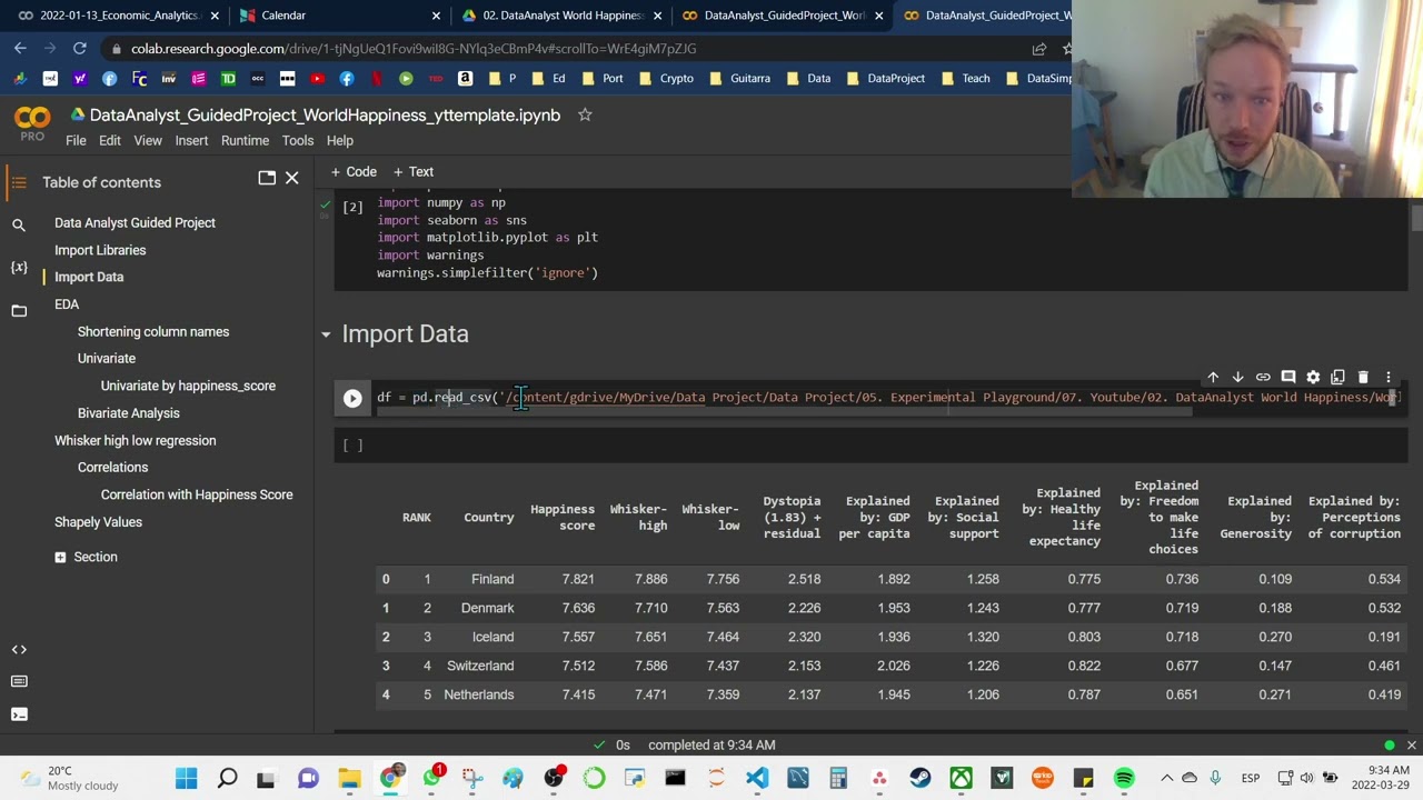
Python data analysis guided project - world happiness index - level 5, 30 min
Use pandas and seaborn in Python to analyze the world happiness index and better understand what affect a countries happiness by analyzing the data.
Nov 23, 20221 min read

python data analysis - Ukraine war June 2022 - level 5, 35 min
Data science and data analysis gives us access to the ability to make our own interpretations from the data. I wanted to see what was...
Nov 23, 20221 min read


Python Data Analysis Guided Project - Develop Marketing Campaign from Customer Data - level 3,29 min
Use the swarmplot in Seaborn in your Python Data Analysis Use pandas and seaborn in Python to analyze the purchasing patterns and relationships of supermarket customers' data in this instructional python guided project as we collect observations and insights that we combine in creative ways to generate profitable marketing strategies based on the data. When completing a data analysis it is less intimidating to just focus on the current task and search for individual insight
Nov 23, 20221 min read
plot many distribution with for loop and seaborn
Use a for loop to loop through a list of the columns and use seaborn to plot all the histograms of our dataset and use them to plot each...
Nov 22, 20221 min read

python data analysis tips kdeplot in seaborn when and why a kde vs histogram
here we use the kernel density estimation plot, kdeplot, to plot distribution and learn when to use a kdeplot versus a histplot in seaborn. the kdeplot can generalize more than a histogram sometimes this can be help to understand overall, higher level pattern. Ai Art Collections DataSimple.education Certifications Data Analysis, Pandas, Seaborn, Plotly and More Data Science Teacher Brandyn YouTube Channel Connect with Data Science teacher Brandyn on facebook on li
Nov 22, 20221 min read
bottom of page