top of page

Search


Python Seaborn Data Analysis Tips - Figure level vs Axes level plots
DataSimple.education Certifications Data Analysis, Pandas, Seaborn, Plotly and More The figure-level plotting tools, relplot , displot , catplot , provide powerful functionalities for visualizing data relationships, distributions, and categorical variables in a concise and intuitive manner. Starting with relplot , this tool is particularly useful for exploring the relationships between two continuous variables. It creates a scatter plot by default, allowing us to identify an
Jun 21, 20233 min read
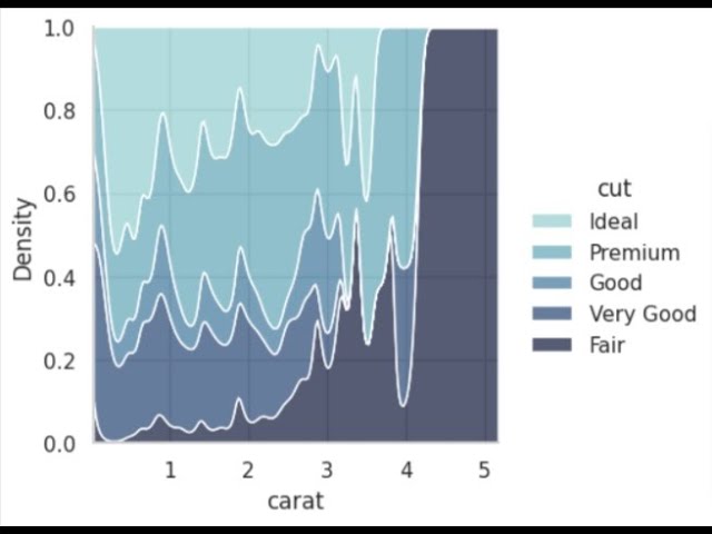
Python Data Analysis Tips - Conditional kernel density Estimate
DataSimple.education Certifications Data Analysis, Pandas, Seaborn, Plotly and More
Jun 15, 20232 min read


Seaborn Python Data Analysis Tips - Override and Customize Seaborn Style
DataSimple.education Certifications Data Analysis, Pandas, Seaborn, Plotly and More Seaborn is a powerful Python library for data visualization that is built on top of Matplotlib . It provides a high-level interface for creating beautiful and informative statistical graphics. One of the key features of Seaborn is its ability to easily customize the visual style of plots using the sns.set_style function. By using sns.set_style , you can easily create your own unique style fo
Jun 6, 20232 min read


Python ML Guided Project- Simple Random Forest in Sklearn, Bank Note Authentication Level 1, 25 min
In this Python guided project, you can follow along and build your first Simple Random Forest machine-learning model. In this Python project, we will use RandomForestClassifier from Sklearn. In is a good idea when doing an ML workflow to have a simple base model that your more robust model will try and beat. In this situation, Logistic Regression acts like our base model and Random Forest acts like our robust complex model. Special Thanks to John David who designed the e
Feb 20, 20233 min read


Python Data Analysis Tips -Detailed Distribution histoplot, kdeplot, stripplot, axvline with Seaborn
DataSimple.education Certifications Data Analysis, Pandas, Seaborn, Plotly and More In data analysis understanding your distribution is usually the first step to understanding your data. In Machine Learning and Deep Learning understanding the distribution of each feature is often more important than understanding what the data means in real life. Well until we start making real-life decisions with ML that is. With Python using Seaborn we make a detailed distribution that a
Feb 8, 20232 min read


Python Data Analysis Tips - barplot Seaborn change outline color edit patches
DataSimple.education Certifications Data Analysis, Pandas, Seaborn, Plotly and More In Python learn how to use the barplot . This...
Jan 27, 20231 min read


Python Data Analysis Guided Project - Analyze Dog Breeds, Level 2, 31 min
Use Seaborn to understand how fur color affects height of dogs in this data analysis project DataSimple.education Certifications Data...
Jan 20, 20233 min read


Python Data Analysis Tips - Anomaly Detection Plot in Seaborn
DataSimple.education Certifications Data Analysis, Pandas, Seaborn, Plotly and More In Python with Seaborn learn how to make an anomaly detection plot. In this example, we use the Google stock price movement in our anomaly detection plot in Seaborn. Stock prices are prone to high volatility and as a portfolio manager, it can be helpful having the ability to detect anomalous movements. To make an anomaly detection plot we will we use several Seaborn plots together. In this
Jan 18, 20232 min read


Python Data Analysis Guided Project - Netflix Movies, Seaborn, Pandas, WordCloud Level 5, 33min
DataSimple.education Certifications Data Analysis, Pandas, Seaborn, Plotly and More Use your Python data analysis skills to better understand the Movies and TV shows in the Netflix dataset. We will use Pandas and Seaborn to perform our data analysis and better understand when new titles are released. Use WordCloud in Python to better understand the most common words in Movie and TV Show titles. Use plotting functions like the pie plot in Pandas . The countplot and histpl
Jan 13, 20231 min read


Python Data Analysis Tips - StripPointPlot in Seaborn, Combine strip and point plots on a FacetGrid
DataSimple.education Certifications Data Analysis, Pandas, Seaborn, Plotly and More In Python Seaborn is a powerful analytical tool. Also flexible in that it is fairly easy to combine multiple plots into one. Here we combine Seaborn's stripplot and pointplot together on Seaborn's FacetGrid to create a StripPointPlot with a beautiful effect for our data analysis in Python. This alsoo turned into a good example of how to plot different scale distributions together in on
Jan 12, 20231 min read


Python Data Analysis Tips - How and why to make a Ridge Plot in Seaborn
Distributions are very important to understand when building a machine or deep learning model. Seaborn's histplot is great for these purposes. In the below workflow in Python you'll see how I would normally quickly and easily do the distribution plots in a loop in with Seaborn's histplot . Seaborn's Ridge Plot allows use to do something similar but with a very interesting effect that is great for presentation to business partners but allows for extra insights that could no
Jan 4, 20231 min read


Real Python Data Analysis Guided Project - Google Forms Survey Response Analysis, Level 3, 21 min
DataSimple.education Certifications Data Analysis, Pandas, Seaborn, Plotly and More Use Pandas and Seaborn in Python to analyze the responses from a survey using Google Forms. Understand the survey response using data analysis skills In this Real Data Analysis in Python project understand the difficulties of dealing with a Real Data Set not found on data from Kaggle. Template Workbook Solutions Workbook Data Science Teacher Brandyn YouTube Channel One on one time with Da
Dec 31, 20221 min read


Python Data Analysis Tips plot all your distributions in one for loop categorical numerical Seaborn
DataSimple.education Certifications Data Analysis, Pandas, Seaborn, Plotly and More Learn how to plot all of the distributions, categorical and numerical, in your DataFrame in one For Loop. we will use Pandas to easily and quickly plot all of the distributions. Plot both numeric and category features in one for loop with Seaborn. Data Science Teacher Brandyn YouTube Channel One on one time with Data Science Teacher Brandyn Follow Data Science Teacher Brandyn On Facebook
Dec 29, 20221 min read


Python Data Analysis Tips when how to use the diverging palette versus light palette in Seaborn
Learn how to and when to use the diverging palette in Seaborn. The light and dark palettes are monochromatic in that they only have one color, when highlighting both positive and negative correlations it is better to use the diverging palette that will highlight how positive and how negative values are. DataSimple.education Certifications Data Analysis, Pandas, Seaborn, Plotly and More Data Science Teacher Brandyn YouTube Channel One on one time with Data Science Teache
Dec 28, 20221 min read

Python Machine Learning Guided Project - Spaceship Titanic part 2 ML Predict, Level 8, 49 min
In the second part of the Python Guided Machine Learning Project, the data scientist picks up where the data analyst left off. We use the data analyst's sights to guide the data scientist preprocessing strategy for machine learning.
Dec 22, 20222 min read

Python Data Analysis Tips Lineplot in Seaborn
In Python learn to use Seaborn's Lineplot. A lineplot is a common type of plot used in time-series analysis. A great feature of...
Dec 18, 20221 min read


Python Data Analysis Tips Seaborn lmplot
Seaborn's lmplot helps use to examine linear relationships. Lmplot, linear model plot, performs a linear regression between x and y. We can also use the row and col argument to groupby a categorical variable and plot the linear correlation between two variables in the subgroups. The lmplot sits on top of the Seaborn's FacetGrid.
Dec 17, 20221 min read

Python Data Analysis Tips FacetGrid in Seaborn apply multple histplot violinplot hue
learn how to use seaborn FacetGrid with seaborn histplot and violinplot. the FacetGrid allows you to with the help of the argument hue, segment your data up to three times this really segments each group and allows you to analyze them at a very low level.
Dec 5, 20221 min read

Python Data Analysis Tips PairGrid Seaborn why to use a PairGrid vs pairplot in Seaborn
learn to use the pairgrid in seaborn, like the pairplot it plots bivariate plots of multiple features at a time, pairgrid allows you to control and add in swarmplots residplots and many others for more insightful data analytics
Dec 5, 20221 min read


Python Data Analysis learn how to control the sub-plotting functions while using Seaborn's jointplot
This modern-day scatterplot allows us to extract valuable insights but it can be tricky to get the right effect. learn the ins and outs...
Dec 3, 20221 min read
bottom of page