top of page

Search

Python Data Analysis Tips - heatmap Seaborn with Seaborn palette when why how
Using Python we plot a heatmap() in Seaborn to highlight positive and negative correlations. we'll learn to use the seaborn heatmap with a seaborn palette generator, diverging palette , or light palette , for either a monotone or diverging palette to help contrast the important insights you've found in your Python data analysis.
Dec 3, 20222 min read


Python Data Analysis Tips - Seaborn Catplot
Here we will learn to use Seaborn's catplot functions. This is a figure-level plot and sits on top of the facetgrid . This will allows us to inspect sub-sub categories. We can also access the swarmplot , stripplot , boxenplot , and many more depending on the generalization we would like to see in our data analysis.
Nov 30, 20221 min read


data analysis tips - displot in seaborn. groupby categories to inspect lower level distributions
use the displot in seaborn to inspect your distributions grouping by up to 3 categories to allow you to inspect the distributions by each sub sub category group. displot in seaborn is a valuable data analysis tool. Understanding the distributions in your dataset is more important, in terms of getting a good score on your model, than knowing what the data represents in real life.
Nov 28, 20221 min read

Python Data Analysis Tips swarmplot how when why to use a Seaborn swarmplot
Python beginner data analysis tips on how to use seaborn swarmplot() . Learn why you would use this distribution plot versus other types of seaborn plots. learn to analyze your data with the swarmplot()
Nov 25, 20221 min read

Python Data Analysis Tips countplot why use Seaborn's countplot
Learn to use Seaborn's countplot() . One of the few plots we can use directly on category columns. understanding the balance or imbalance in our categories is very important because it will affect how our machine-learning model learns. Understanding imbalance in categories is even more important with training a deep learning model.
Nov 25, 20221 min read

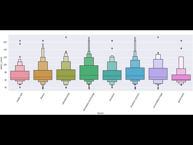
python data analysis tips boxenplot how when why to use a boxenplot
With Python, learn to use the boxenplot() in seaborn and a modern combination of a box and histogram() plot. learn when, why, and how to use the boxen plot to the fullest in your analyses. Boxenplot() are a great middle ground between the generalization of the boxplot mix with the detail from a histogram() .
Nov 25, 20221 min read

Python Data Analysis Tips violinplot in seaborn when how why to use violinplot
In python, why would you use seaborn's violinplot() versus any other distribution plot? learn how, when and why you would use the violinplot() to gain extra insights that could be missed by other plots. Use hue with split=True to extract some interesting data analytical insights for your business partners.
Nov 25, 20221 min read

Python Data Analysis Tips Seaborn boxplot when how and why to use a boxplot
Data analysis tips in python for using seaborn's boxplot() functions. Why would you use a boxplot versus a histogram? learning arguments to control which outliers you're focusing your analysis on. Boxplots are most often used in outlier detection but controlling the ability to find outliers that concern you in your analysis can be valuable.
Nov 25, 20221 min read

Python Data Analysis Tips kdeplot in Seaborn when and how, why to use kdeplot vs histplot
In seaborn with Python, we use the kernel density estimation plot, kdeplot() , to plot distribution and learn when to use a kdeplot versus a histplot in seaborn. This helps to generalize our data and can lead to valuable analytical insights.
Nov 25, 20221 min read

python data analysis tips histplot in seaborn when and how to use histplot
In Python, learn to use how and when to use the histplot() in seaborn to get the most out of this analytical tool. Inspecting and then understanding the distribution in you dataframe leads to go predictions. Understanding and analyzing your distribution helps make you engineer features that will aid in Machine learning predictions.
Nov 25, 20221 min read


showcase of some beautiful plotting skills.
hightlight some amazing plots done in Python with matplotlib, pandas, and seaborn. Check out the original post at the art of data science...
Nov 24, 20221 min read

Python Data Analysis guided project - Sri Lanka Economic Analysis. Level 7, 26 min
Study what happened to the Sri Lanka economy with python from 1966 to 2022 and see if you can understand what lead to the high inflation and low employment that the country faced during and after the pandemic. Use matplotlib.pyplot as plt to assist us in plotting two Seaborn lineplot and scatterplots together. They create stunning effects in your Seaborn plots and add a really nice professional touch to your seaborn plots. This is the Sri Lanka economy over time and so we
Nov 23, 20221 min read
Python Data Analysis guided project - Data Analyst Job Listings, Level 6, 23 min
Here we use Pandas and Seaborn in Python to go through the job listings for Data Analyst Job Postings. we'll have to do a lot of cleaning of the string features to be able to analyze this data set. Let's explore which type of Data Analyst gets hired, and has the biggest salaries. Business analyst, data analyst, BI analyst etc. Also explore important factors like education, year of experience, and location make on data analyst salaries in this instructional Python learning
Nov 23, 20221 min read

python data analysis - Ukraine war June 2022 - level 5, 35 min
Data science and data analysis gives us access to the ability to make our own interpretations from the data. I wanted to see what was...
Nov 23, 20221 min read


Python Data Analysis Guided Project - Develop Marketing Campaign from Customer Data - level 3,29 min
Use the swarmplot in Seaborn in your Python Data Analysis Use pandas and seaborn in Python to analyze the purchasing patterns and relationships of supermarket customers' data in this instructional python guided project as we collect observations and insights that we combine in creative ways to generate profitable marketing strategies based on the data. When completing a data analysis it is less intimidating to just focus on the current task and search for individual insight
Nov 23, 20221 min read
plot many distribution with for loop and seaborn
Use a for loop to loop through a list of the columns and use seaborn to plot all the histograms of our dataset and use them to plot each...
Nov 22, 20221 min read
python data analysis tips kdeplot in seaborn when and why a kde vs histogram
here we use the kernel density estimation plot, kdeplot, to plot distribution and learn when to use a kdeplot versus a histplot in seaborn. the kdeplot can generalize more than a histogram sometimes this can be help to understand overall, higher level pattern. Ai Art Collections DataSimple.education Certifications Data Analysis, Pandas, Seaborn, Plotly and More Data Science Teacher Brandyn YouTube Channel Connect with Data Science teacher Brandyn on facebook on li
Nov 22, 20221 min read


python data analysis tips lmplot seaborn control the underlying scatter & line plot with kws
learn to use the lmplot in seaborn. this plots the linear relationship of two variables and is built on top of the facetgrid and allows us to separate our data up to 3 levels and inspect and extract insights at a granular level. Python Ai-Enhanced Bootcamps Ai Art Collections DataSimple.education Certifications Data Analysis, Pandas, Seaborn, Plotly and More Data Science Teacher Brandyn YouTube Channel Connect with Data Science teacher Brandyn on facebook on linke
Nov 21, 20221 min read
python data analysis tips histplot in seaborn when and how to use histplot
learn to use how and when to use the histplot in seaborn to get the most out of this analytical tool. Inspecting and then understanding the distribution in you dataframe leads to go predictions. histograms are a really really important tool to understand yor distributions and then the preprocessing need to enhance predictions and scores Data Science Teacher Brandyn YouTube Channel Connect with Data Science teacher Brandyn on facebook on linkedin Python Ai-Enhanced B
Nov 20, 20221 min read


python data analysis seaborn lineplot
python data analysis tips for beginners, when to use lineplot seaborn and use hue argument correctly. lineplot has many valuable uses...
Nov 20, 20221 min read
bottom of page